I had originally called this blog post, “The 6 Rules of Visual Design” but then I realized…
This post is written for people who are new to visual design. My original goal was to offer guidance to new developers who wanted to add some finesse to their projects or website, but I think that anyone who wishes they had that enviable “eye for design” will benefit from these tips. I want to pull back the curtain a bit, and share some of the resources that will make designing your next project much easier.
Side note: I only included free resources in this article. I firmly believe that creators should be compensated for the things they create, and I encourage you to explore the amazing fonts, icon libraries, photos, etc. out there for sale. However, there are a lot of really great free resources to get you started, and you should definitely leverage these while you’re learning. I’ll include a concise list of these resources at the end.
Okay, back to it…
I’ve noticed that a lot of new coders are often intimidated by CSS—or rather, by the prospect of making visual design decisions while also trying to learn CSS. If you’re in that boat, you can relax a little—as a developer on a team, you’ll get design specs and prototypes to work from. Someone will have already made those design decisions—you just have to build it.
However, having at least some concept of good visual design will come in handy, especially as new devs build their own projects that will hopefully catch the eye of a hiring manager.
Also, I use the term “website” throughout this article, but these tips apply to the visual design of desktop, web, and mobile apps as well.
Let’s dive in!
1. Whitespace is Your Friend
Erik Kennedy’s advice to “double your whitespace” is spot on. In this era of clean, minimalist design and spacious layouts, you are much more likely to have too little whitespace (the negative space around your elements) than too much. This applies to both font spacing and overall layout.
Font
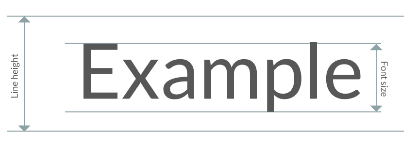
The height of the whitespace around a line of type is called line-height in code and “leading” (pronounced ledding) in design. The default height of each line is usually 1.2 times the height of the type, so a 20px font would have a 24px line height. However, this spacing still feels crowded to me. My go-to is 1.5 to 2 times the font size. For context, the type you’re reading is 18px font with a 32px line height.
Also, put a max-width on your paragraphs. It’s not easy for the user to read paragraphs that span the full width of a webpage, and it makes for some wonky paragraphs. The general rule of thumb is to keep the width of your paragraphs to ~12 words per line.
Layout
You’ve probably been told to put important information “above the fold” of your website—in the top portion where the user doesn’t have to scroll to find it. This means put engaging, interesting, intriguing content as the first thing your user will see when they come to your site. It doesn’t mean cram everything you can in this top section.
Check out this website for a (fictitious) company that sells wind turbines. The site is a pretty common layout, but it feels especially cramped and the elements are in desperate need of breathing room.
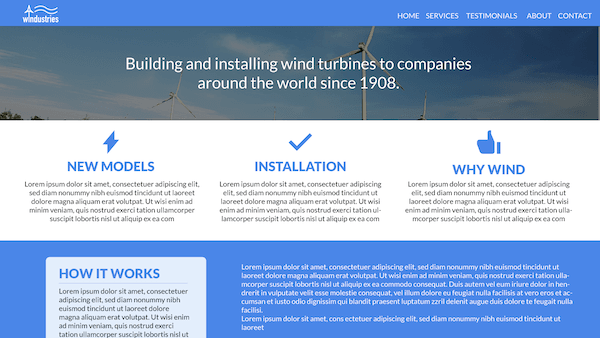
I added white space in the header, in between the nav links, around the company description, in the three-column layout, and in the How it Works section. With just those changes, the page is looking much better.

2. Pick a Solid Font
My favorite source for fonts is Google Fonts. They have a really nice range, all free and all ready to be plugged into your project.
But there are so many options—how do you narrow it down and find a great font for your site? Here’s what you should consider.
Font Faces
When we talk about fonts, what we really mean is the font family (also known as type families in print design). The font family is made of up font faces, such as bold and italic. For example, this paragraph’s font family is Lato (one of my favorites) and the typeface is Lato Light.
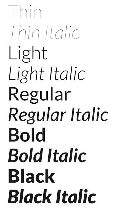
A lot of the options in Google Fonts have up to 16 font faces, but some (usually script or display fonts) only have one. Make sure to pick a font family that has what you need.
Conversely, you probably only need four to six font faces on your site (for example: light, light italic, regular, regular italic, bold, bold italic). Since loading more font faces means longer load times, only include what you need.
Legibility
The next thing to consider as you pick a font is what it will look like at large and small sizes. Some fonts work great for headlines at 48 pixels but aren’t very easy to ready at 14 or 16 pixels. Pairing fonts—one for headlines, one for everything else—is common practice. But if you’re just starting out, it will probably be easier to use a font that works well at a variety of sizes.
License
An obvious reason why I love Google Fonts is because their fonts are open source. If you decide to use a font that’s not in the Google Fonts catalog, please make sure that you are using an open source font, or that you have the proper license.
Style
Typefaces are broken into two different distinct categories: serif and sans serif. Serif fonts have little “flags,” whereas sans serif (literally “without serif”) do not.
From there, typefaces are broken down into even more categories. Here are the most common:
- Serif - has extra detailing, or flags, on the letter.
- Sans Serif - doesn’t have any detailing.
- Monospace - every character in a monospace font is the same width, so two lines with 80 characters are the exact same length.
- Display - funkier, with more personality but fewer places where it can be used (for example, not as paragraph text).
- Script/handwriting - more personality, but again, fewer places where you can use it.

What style of font do you want to use on your site? What kind of branding does a serif font bring vs. a script font, or a monospace rather than a display? This leads us to consider…
Convention
As you pick a font, consider where and how else it is used, and what it communicates. For example, news and fashion sites tend to use serif fonts. Tech startups often use sans serif fonts. Monospace is used in code and text editors. Script and display fonts bring personality, but make sure that they fit with the overall brand and style of your website.
3. Be a (Color) Minimalist
It’s really easy to overdue color in a design. The best approach is to start with black and white. I avoid using pure black because it looks too stark (read this article if you need convincing). I prefer to replace black with dark gray, like #262626.

From there, add shades of gray. A common way to differentiate sections without adding visual weight is to put a white background on one section and a light gray background on the next. You can apply this with website sections, or cards within your app. We’ll get more into this in the next section.
Most brands have just two colors: a primary and a secondary. Color communicates a lot, so if you’re curious, read up on color psychology.
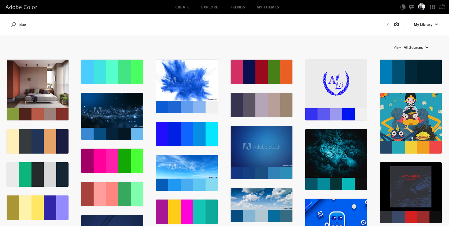
Adobe Color is a fantastic resource for finding good color palettes. You can search for palettes based on a specific color, upload an image that has the color(s) you want to use, or create your own palette from scratch.
4. Nix Lines and Borders
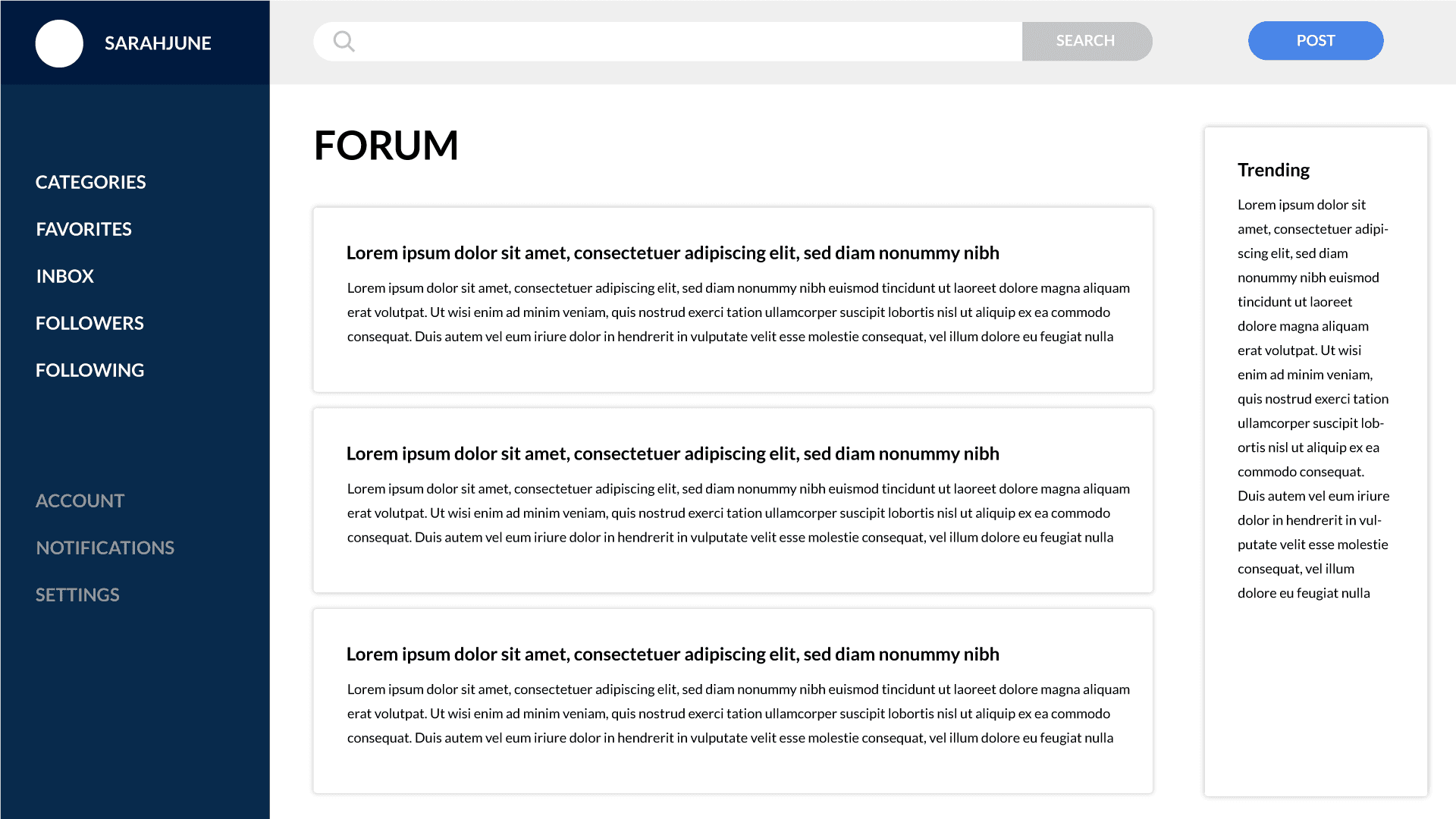
Using lines is an easy way to create distinction between sections, but it’s hardly the best option. It quickly creates a cluttered interface, as you can see in the below prototype for a generic forum.
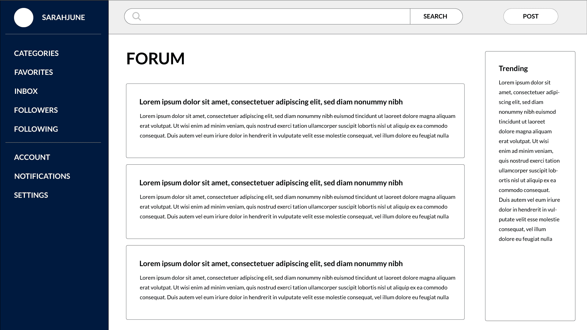
Adding a colored background (or very light gray, as mentioned above), leveraging grouping, and applying some drop shadows are all great always to separate sections, and look, Ma! No borders!
5. Use High-Quality Images
Do you know where to find high-quality photos for your site? If you said a Google image search, you’d be very wrong. Don’t ever (ever!) use a random photo you find on Google—for anything. It’s most likely copyrighted and you can get into some hot water if you use it in your project without permission.
Thanks to pretty solid cameras in every smartphone, you could take photos yourself. But good photos require more than just good equipment (and I would argue that smartphone cameras can’t yet compete with a DSLR and good lighting).
A much better option than committing copyright infringement or going the DIY route is to leverage sites like Unsplash, Pexels, or Pixabay. There are others but these are my favorites, both for quality and variety—and some even have video!
You have the option to “tip” the photographer if you’d like, which is very cool, but at least consider giving a link or credit back to the original post where you got the photo. Sometimes that’s not practical (like in print design or on your marketing website). But, for example, I use photos from Unsplash for the header images on this blog, and have included in the design a credit link back to the photographer.
6. Leverage Icons
Last but certainly not least, iconography can be a great addition to your design. Icons communicate ideas quickly, which means pairing them with elements like menu options can help your user find what they’re looking for quickly.
As with fonts, it’s important to know the conventions of icons before you start plugging them into your design. If your user sees an icon that looks like a house, they’re going to assume that clicking on it will take them to the home screen. Three vertical lines (the “hamburger” menu) means an expandable menu, gears mean settings, a magnifying glass means search, etc. Before adding icons to your site, do some research on the conventions of either the icon you want to use or the idea you’re trying to communicate, to avoid confusing your users.
If you need a free icon library, I recommend Zondicons or Font Awesome. Just don’t mix icons from different sets! Icons are designed to match the rest in the library, so don’t mix them.
Conclusion
Thanks for making it to the end! I hope this was helpful to you as you learn more about the world of visual design.
Here are all the resources I mentioned above:
- Fonts: Google Fonts, Font Psychology
- Colors: Adobe Color, Color Psychology, Never Use Black
- Images: Unsplash, Pexels, Pixabay
- Icons: Zondicons, Font Awesome
If you have comments, questions, or (constructive) feedback, feel free to hit me up on Twitter!


